
Preço Certo
A tool for analyzing product prices
and financial indicators.
Context & Challenge
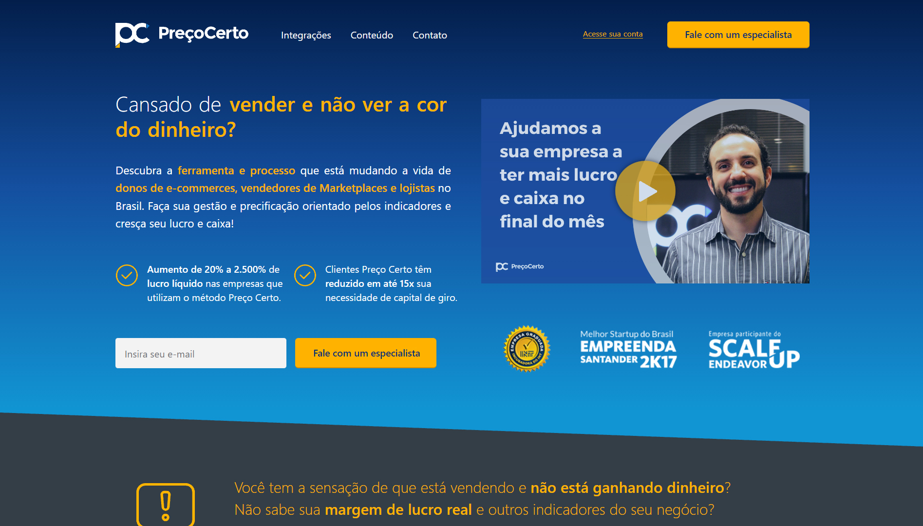
Preço Certo is a platform focused on pricing and financial intelligence for small and medium-sized companies. I was responsible for the complete redesign of the product experience, including brand strategy, Design System, UX Research, prototyping, and testing. The main challenge was to transform a dense and confusing platform into a fluid, reliable, and accessible experience for different user profiles — from entrepreneurs to financial analysts.
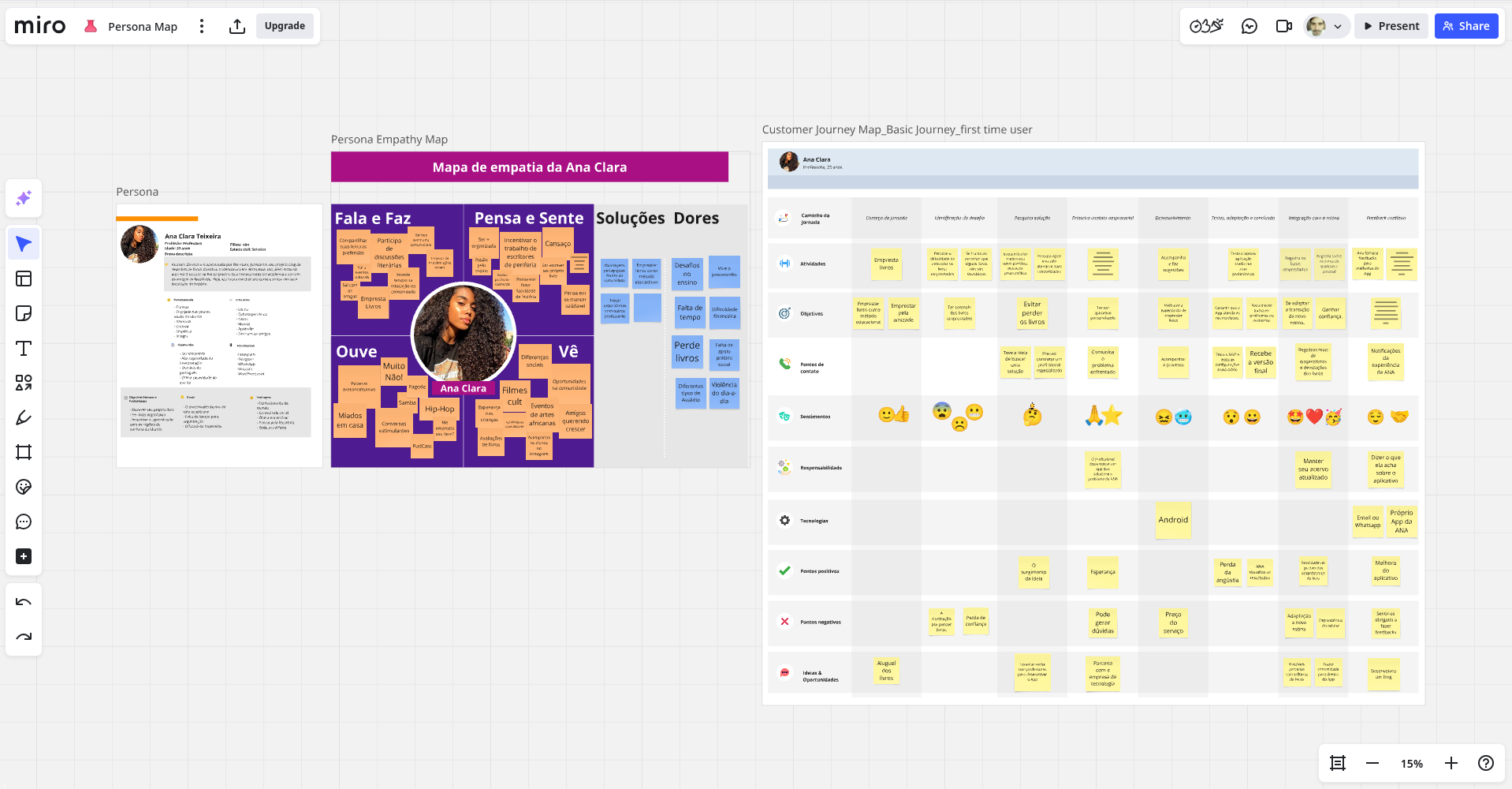
Discovery & UX Research
Before making any design decisions, I conducted a discovery phase focused on identifying the platform’s main pain points. The steps included:
- Desk Research: mapping the market, competition and similar solutions.
- Interviews with users and stakeholders: focusing on behavior, needs and frustrations.
- Current user journey: identifying usability gaps and opportunities for improvement.
- Affinity Mapping + User Flows: consolidating insights and organizing them by theme.


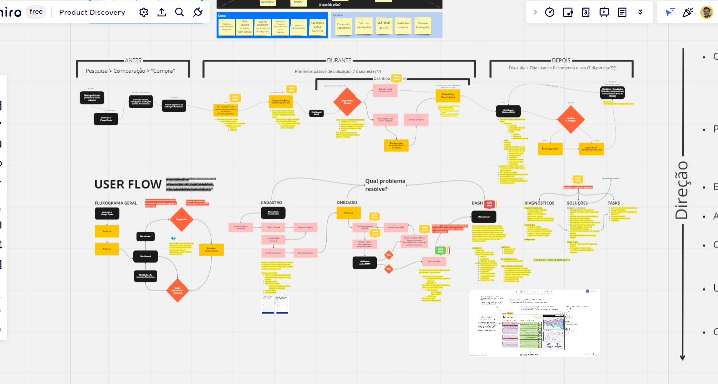
Product Strategy
Using the research data, I built the information architecture and defined the main product flows, focusing on scalability and clarity of use:
- Prioritization of features based on impact vs. effort.
- Creation of sitemap and optimized flows.
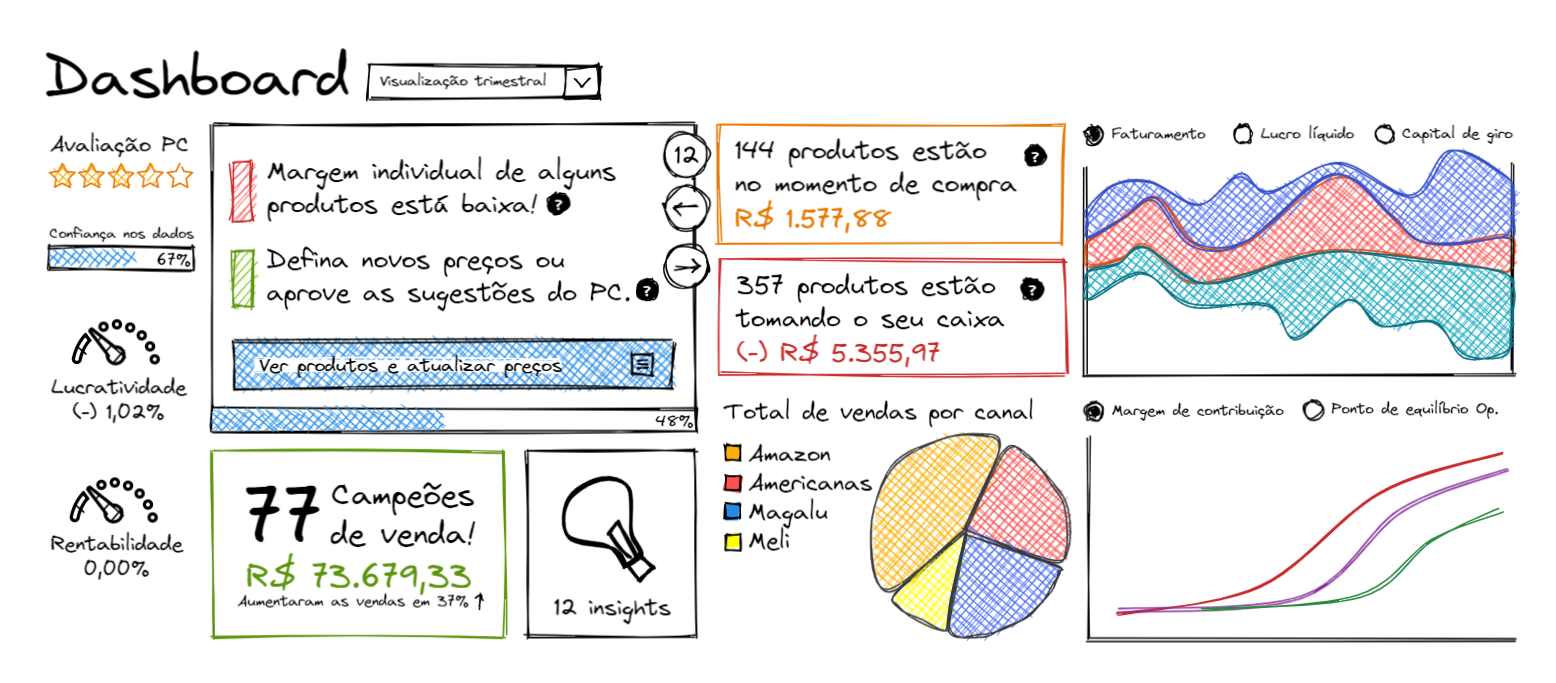
- Low-fidelity wireframes validated with users.
UX Writing & Accessible Communication
During the process, I realized that many users had difficulty with the platform's overly technical terminology. Therefore, I strategically restructured the copy, using more accessible, simple and objective language — without losing credibility.
- I redefined complex financial terms in practical and visual language.
- I added contextual tips and guidance messages at key moments in the journey.
- I created a more human and approachable tone of voice, aligned with the brand's new identity.
🎯 Result: greater understanding of the features, reduced usage errors and increased user confidence in the product.
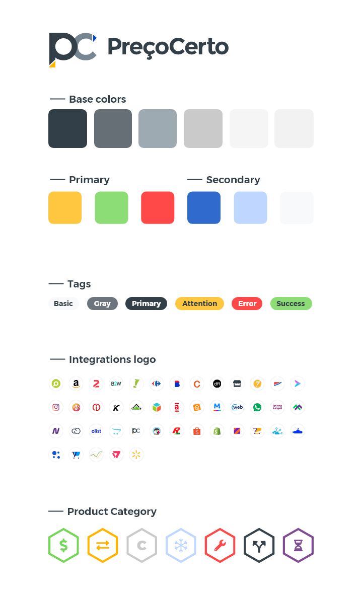
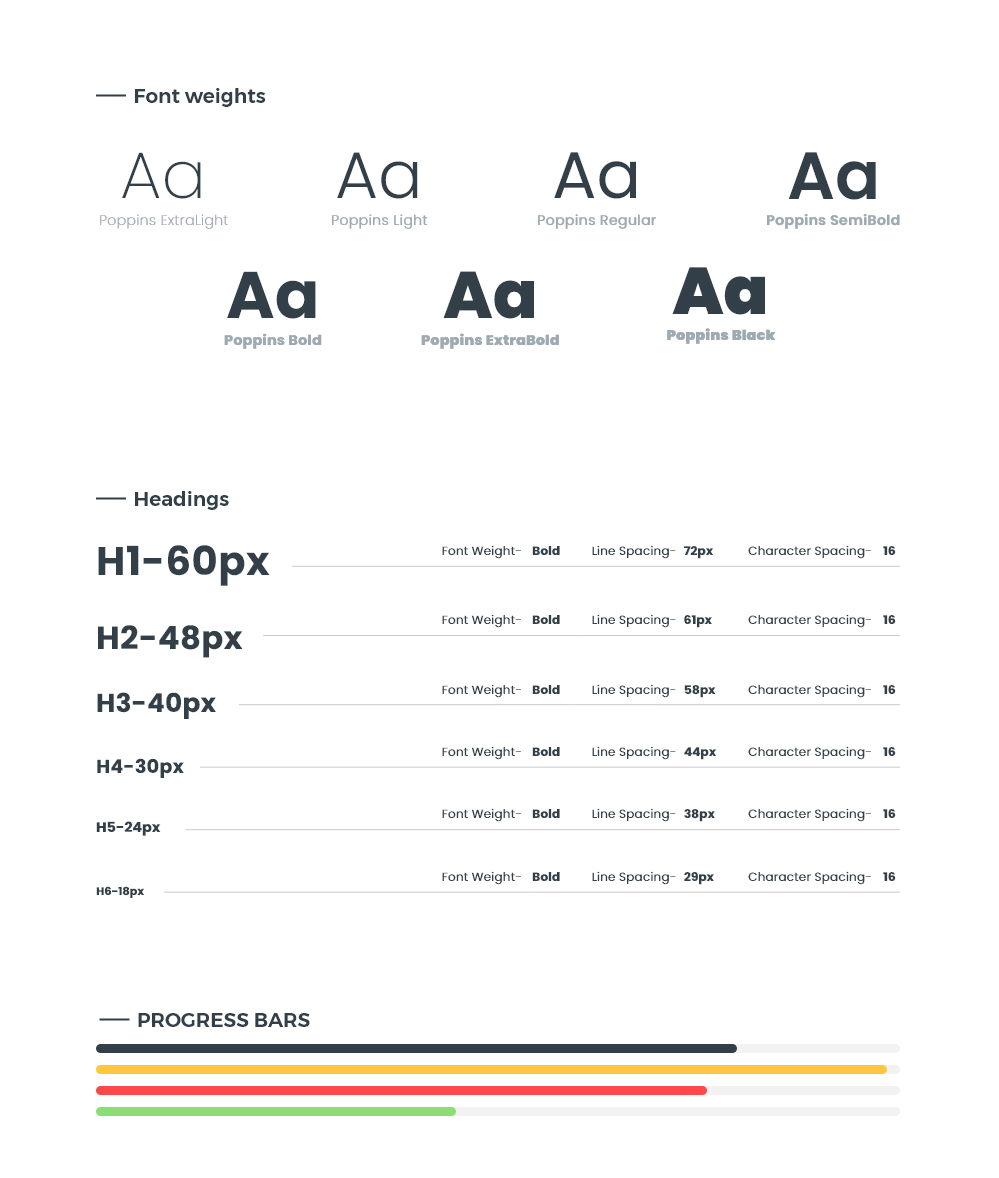
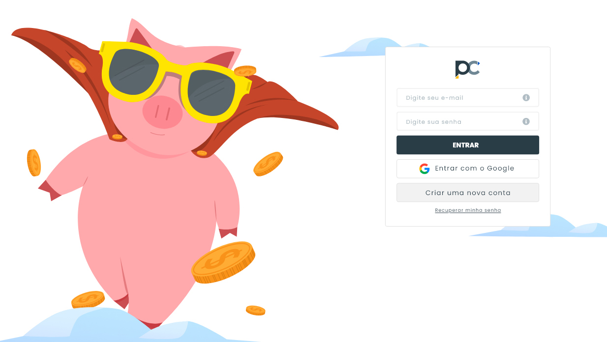
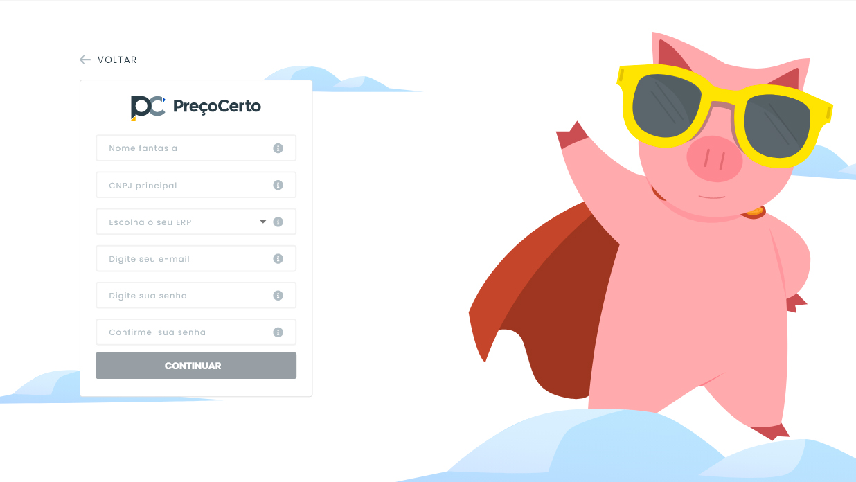
Design System & Visual Language
Preço Certo's visual redesign was guided by the creation of a robust Design System, with a focus on scalability, accessibility and visual consistency:
- Updated and accessible color palette.
- Standardized typography and spacing.
- Reusable components in Adobe XD.
- Custom and intuitive icons
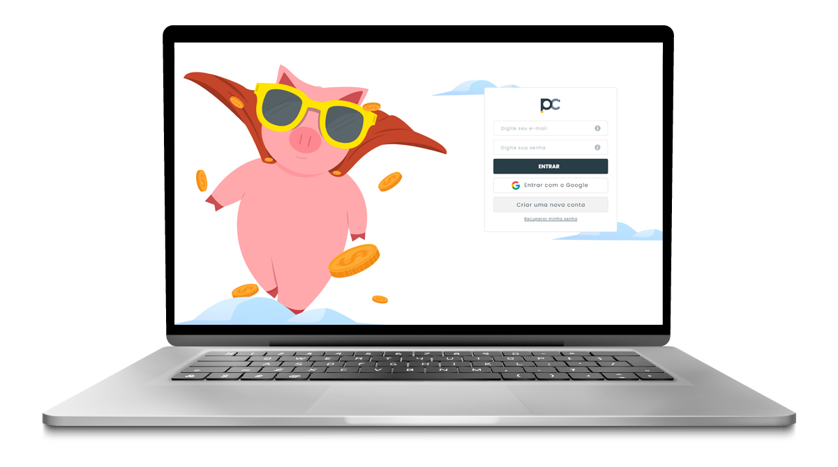
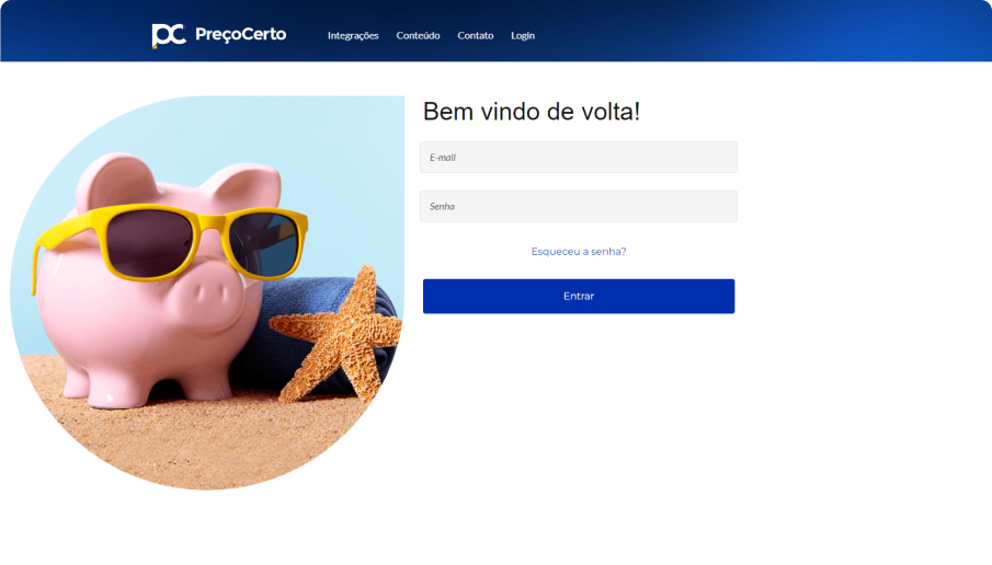
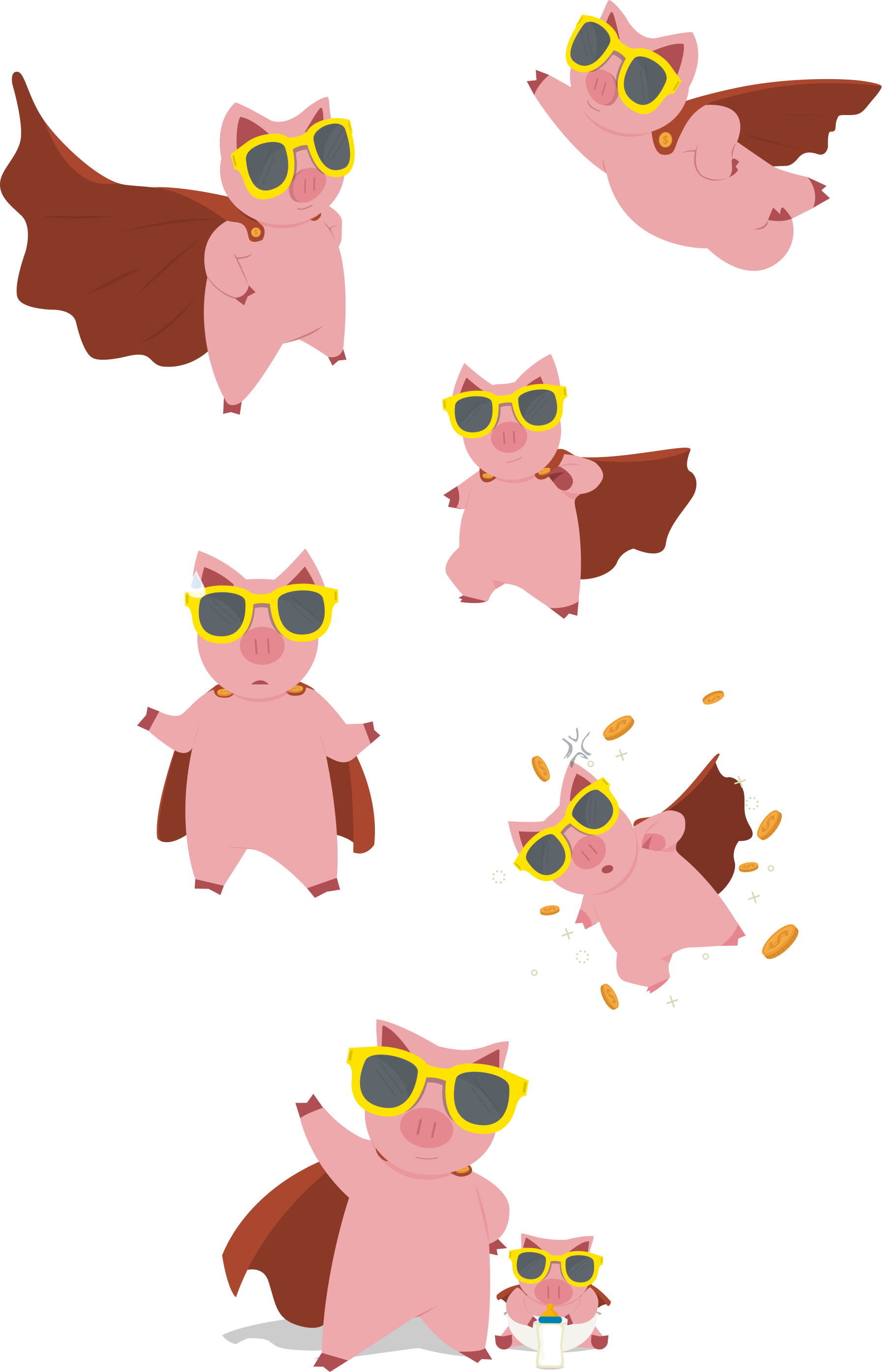
Mascot and Brand Identity
The mascot was kept because it is a recognized symbol among users, but it underwent a visual overhaul to align with the new product language. We explored variations in use, expressions and application in the platform's flows.
🎯 Objective: to generate empathy with the user and reinforce the brand's friendly identity.
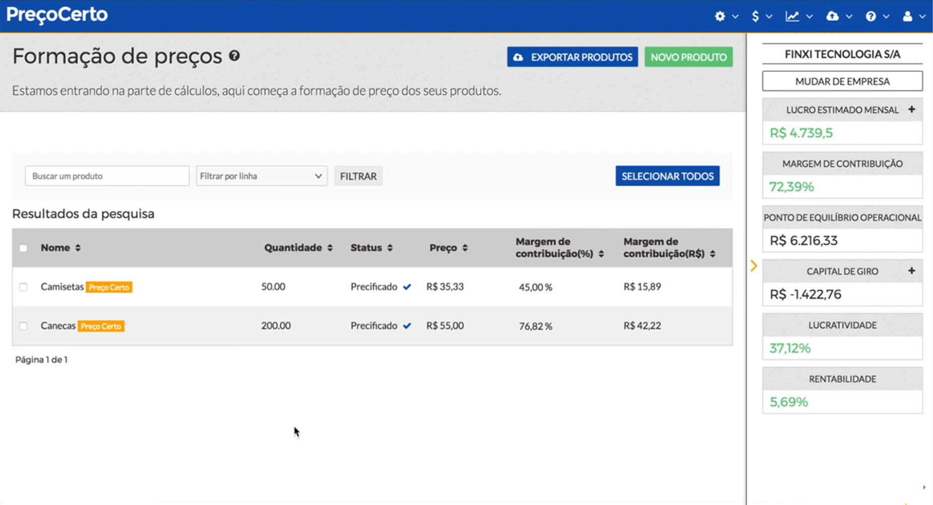
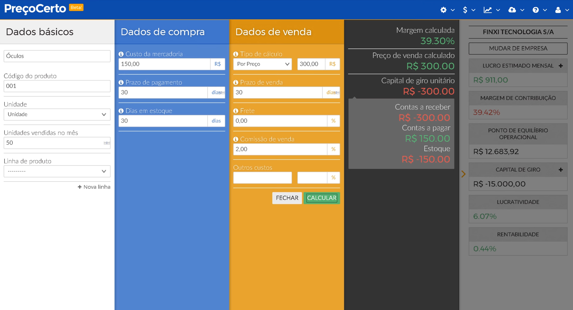
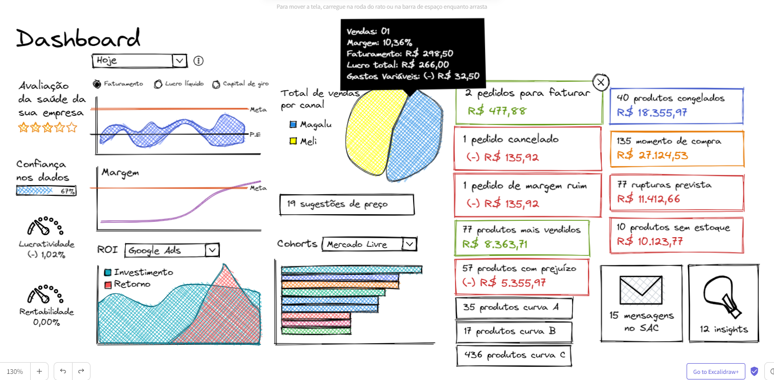
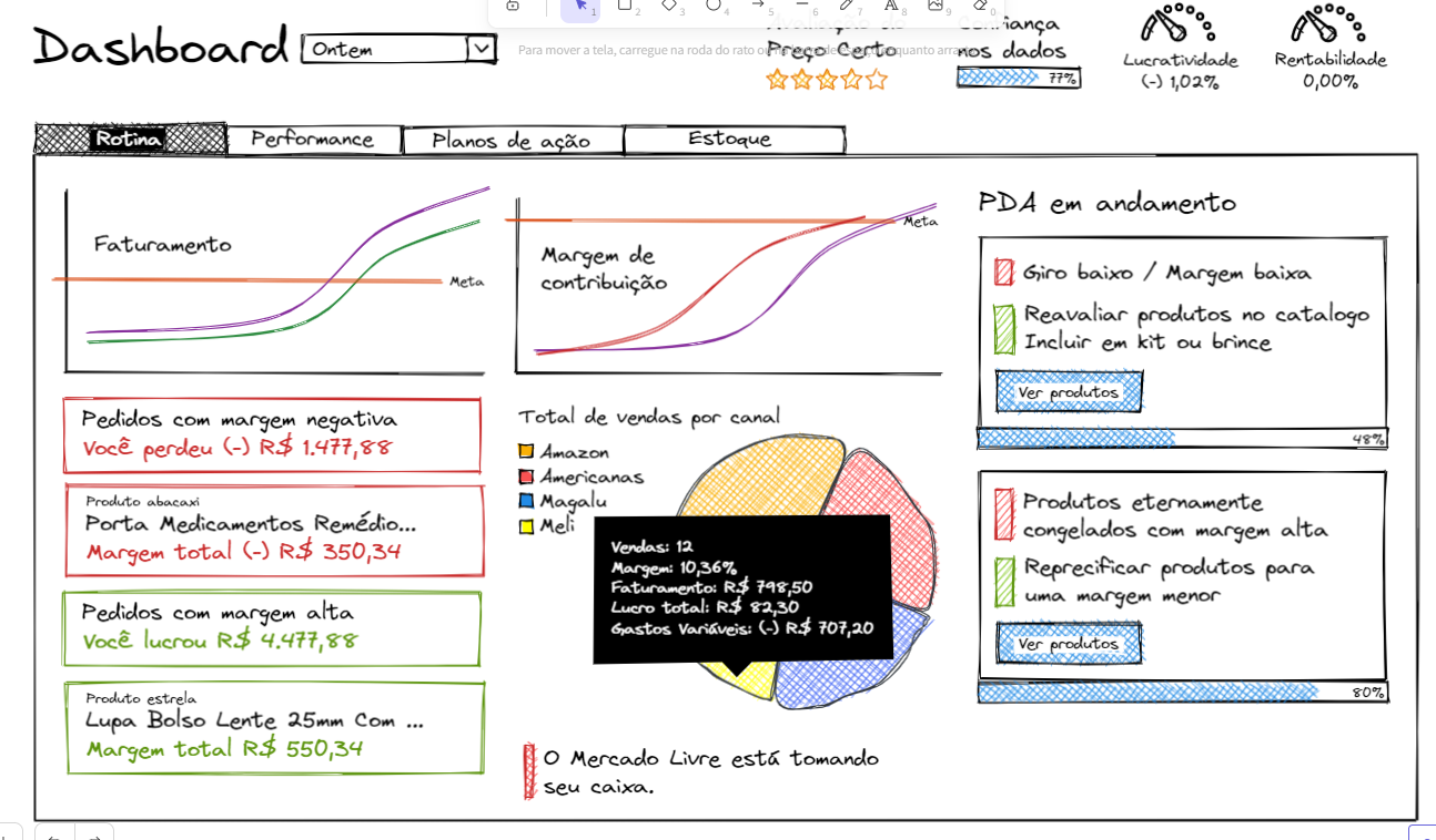
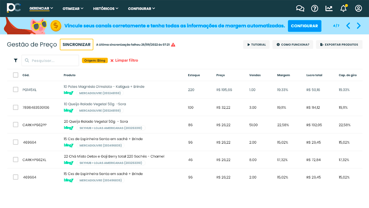
UI Design & Prototyping
The UI was designed based on Design System guidelines, applying the learnings from the discovery phase:
- Intuitive interfaces based on a clear hierarchy of information.
- Microinteractions and visual feedback at critical points in the journey.
- High-fidelity navigable prototypes tested with end users.

Results
-
+2500% increase in net profit for some clients.
-
Reduced rework with a clearer, easier-to-use UI.
-
Increased engagement, reducing churn by 70%.
The new Preço Certo layout has brought clarity to our operations and improved my understanding of my indicators. We can finally visualize our results quickly.
Conclusion
The PreçoCerto tool proved to be highly effective, leading to a notable increase of up to 2,500% in net profit for companies that used it.
With its newly enhanced user-friendly interface and intuitive features, Preço Certo today offers a streamlined process that empowers businesses to optimize profitability and increase cash flow effortlessly.
Notably, clients have experienced a substantial reduction of up to 15 times in their working capital needs. Today, Preço Certo has a solid foundation to evolve its features with consistency and scalability.

