

Design principles constitute a set of predominantly visual concepts, used by designers to create aesthetically pleasing and functionally organized work. These principles are interconnected, complementing and influencing each other. The list of these principles may vary depending on the speaker and the specific branch of design under consideration. Here, we’ve put together a comprehensive guide to the principles that will improve your compositions in Adobe Express.
Emphasis and Hierarchy
Emphasis aims to draw the viewer to a focal point by manipulating a design element to make it stand out. Certain aspects of a design naturally attract the viewer’s attention. By giving visual weight to a certain aspect of the design, we make it stand out. This can be achieved in a number of ways, such as through color, texture, font, or scale. Additionally, you can highlight elements by manipulating other design principles, such as scale or contrast.
Often confused interchangeably, emphasis is closely related to hierarchy, which consists of strategically assigning visual importance to each design element. To this end, it is essential to consider the most relevant information within the design and organize the elements appropriately. A common approach to establishing hierarchy is by outlining design aspects from most to least important. Visual hierarchy can be created through emphasis and other principles, generating a natural order by which the viewer interacts with the design.
Contrast

Contrast concerns the way in which elements of a design differ or oppose each other. By employing contrast, you can make aspects of a design more distinct. Additionally, contrast can serve as a point of emphasis, communicating differences in a narrative way. Consequently, it can play a significant role in the visual hierarchy. High contrast tends to make elements stand out. Color plays a crucial role in this aspect, as adequate contrast between colors provides a clearer and more readable visual experience.
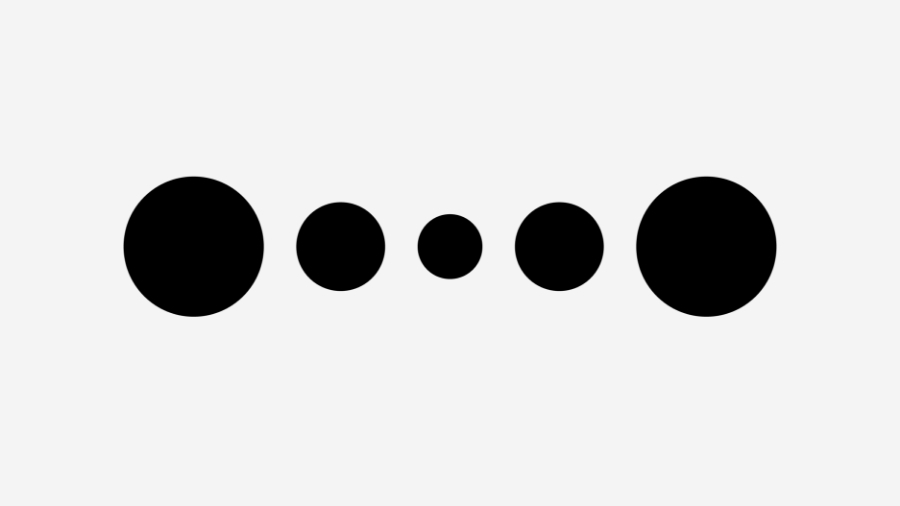
Repetition and Pattern

Repetition simply consists of repeating design elements. Some repetitions may go unnoticed, as is the case with the repetitive use of a font or color. Other repetitions are more evident, as they appear as an intentional pattern, like a chessboard. Repetition can also be employed to create emphasis. By repeating design elements, you can create familiarity and understanding by bringing the elements together. Additionally, repetition can establish a connection between designs, as in the case of a logo or color scheme. It creates consistency, bringing together disparate pieces as if they were connected, whether for a series of works or to build a brand identity.
White Space or Negative Space

White space, or negative space, is a unique principle because it is about what is not included. It is crucial for providing lightness and clarity to the composition, clearly differentiating the elements and allowing room to breathe. White space gives organization and order to the composition, as well as making it easier to achieve balance. It can also be used to highlight elements and create rhythm.
Movement and Rhythm
Movement and rhythm aim to direct the flow of a composition and influence the movement of the eye. How does composition affect visual attention? Rhythm can be established through repetition and the way items are spaced. There are countless ways in which elements can be distributed in a given area, whether regularly, randomly, organically or progressively.
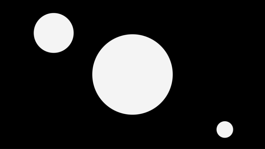
Scale and Proportion
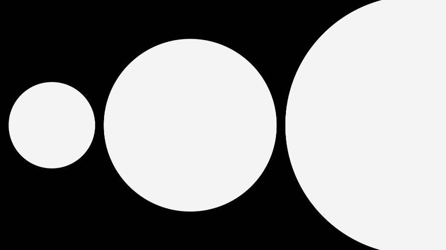
This principle concerns the size and weight of the elements present in the design, as well as the way they relate to each other. Changing the scale of an element affects its relationship with the other elements and, therefore, with the entire composition. This is because scale plays a crucial role in visual hierarchy. Generally, larger elements will be perceived as more important, while smaller elements will be considered less relevant.
Balance and Alignment

Two-dimensional visual designs have horizontal and vertical axes. Each design element adds visual weight to the composition. Therefore, successful composition requires balance. Alignment refers to the arrangement of elements along axes and is used to create balance. This balance can be achieved symmetrically or asymmetrically. In symmetrical balance, the weight is distributed equally between the axles. In asymmetrical balance, non-corresponding arrangements are used that have equivalent visual weight. For example, a title positioned on the left on a poster may require an image to be placed on the right to create an asymmetrical balance.
It can be helpful to conceive of a two-dimensional drawing as a three-dimensional shape, on a flat plane like a canvas or sheet. Elements that are unbalanced due to visual weight will result in an unbalanced composition.
Unit

Unity refers to the way different design elements interact when placed together. It’s about creating visually harmonious designs in which all the distinct elements coexist in an organic and cohesive way. In other words, the elements combine to form a clear and effective whole. Within the unit, there are aspects related to both the visual unit and the conceptual unit. Visual unity implies providing visual meaning, while conceptual unity concerns the purpose of the visual elements and the effectiveness of the message conveyed by the composition.
Unit assessment of a design often occurs at a later stage in the design process and can represent the final step before something is considered complete. If a design does not appear to be unified, it may be helpful to review the previously mentioned principles when adjusting aspects of the composition. Regardless, reviewing these principles can be helpful in creating the most effective final product.