
Grape Vibes
More than a wine brand — an attitude brand.
Context and Challenge
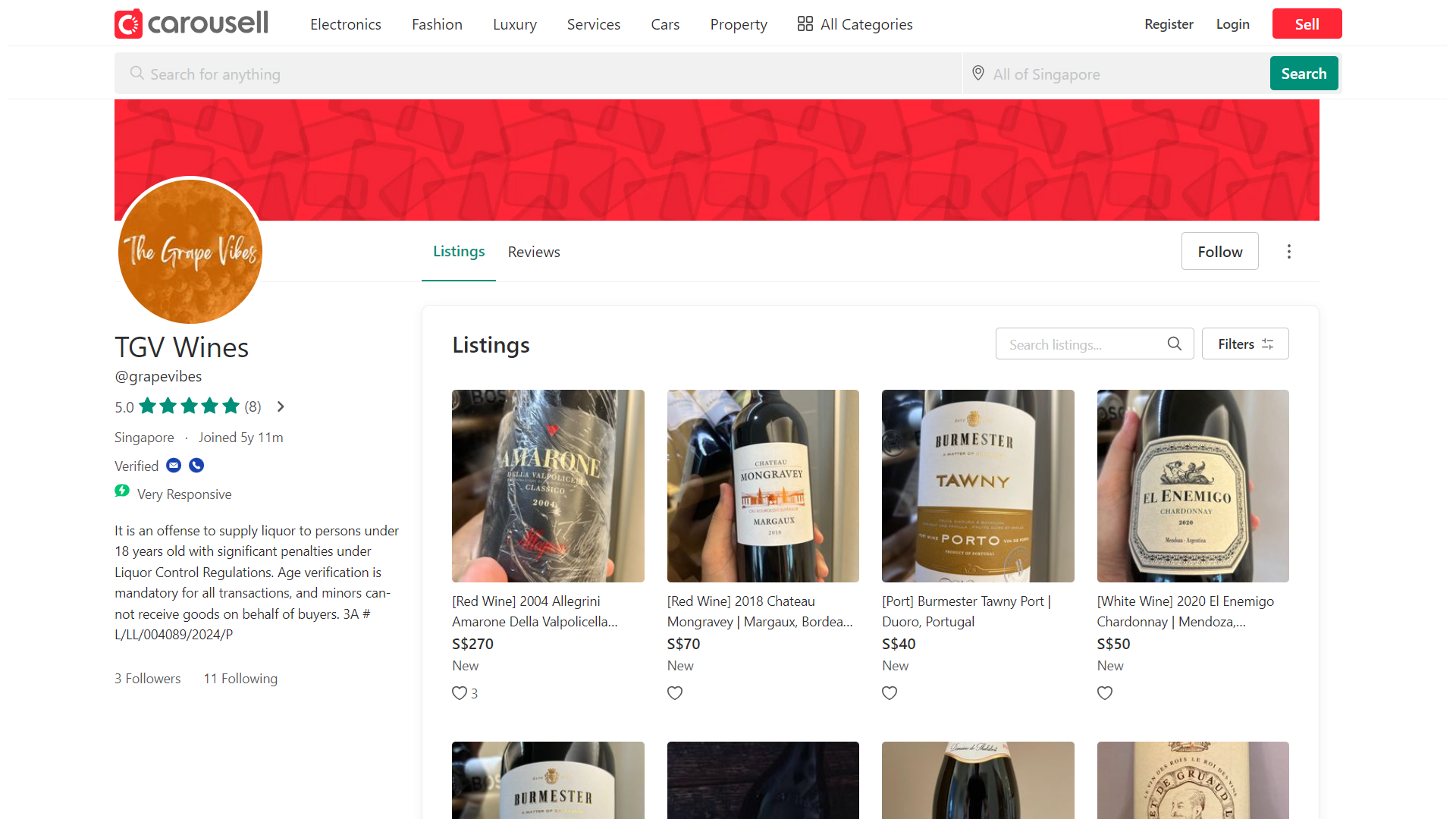
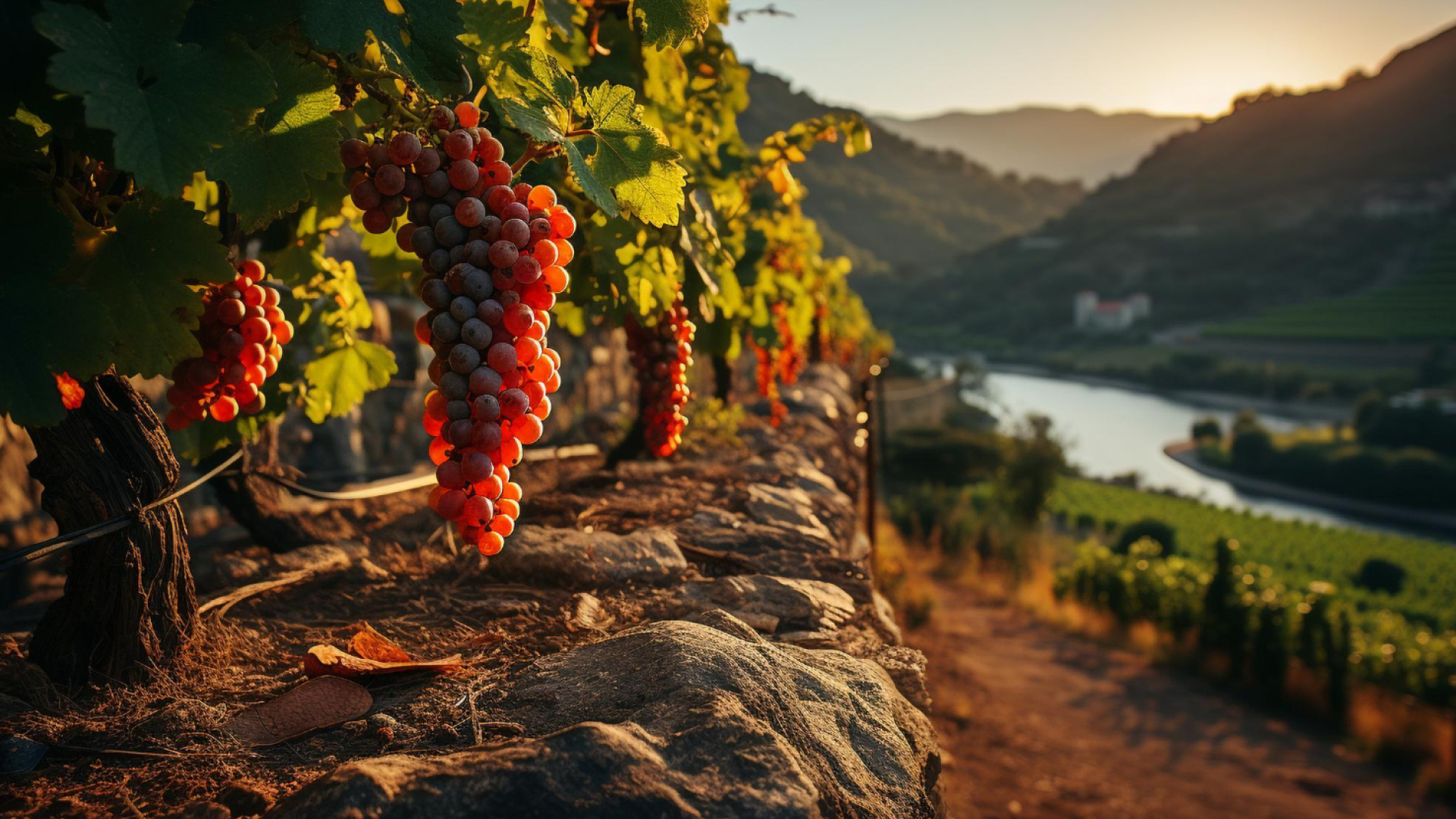
Grape Vibes is a wine brand focused on young adults in Singapore, selling through the Carousell marketplace. The challenge was to create a visual identity that communicated lifestyle, lightness, and sophistication, without falling into the traditional or outdated stereotypes of the segment. The client wanted a visually modern, accessible, and thought-provoking brand—something that could be applied to both labels and digital media, and that would connect with consumers emotionally.
Market Research and Visual Inspiration
Before creating any visual elements, I began researching how wine brands positioned themselves in Southeast Asia. I used the Carousell marketplace and Pinterest as sources of visual reference and competitive analysis. I focused on understanding how wine was communicated visually: tones, fonts, icons, and label styles. I discovered a gap between brands that were "too traditional" and others that were overly caricatured. This insight was essential to building something modern, yet still authentic to the wine universe. Thinking about the brand's context, I was able to derive some examples of how we might interpret the brand:
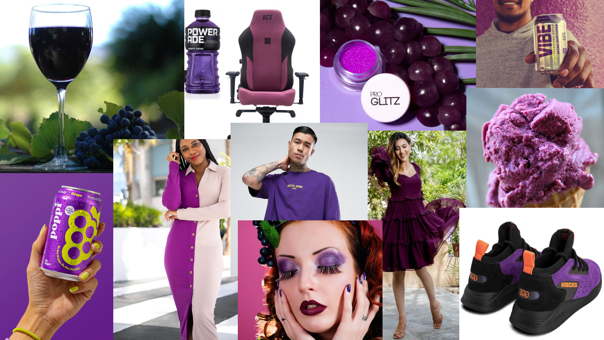
- The feelings or atmosphere associated with grapes, such as relaxation or enjoyment.
- A mood reminiscent of grapes or vineyards, possibly relaxed or sophisticated.
- A positive or enjoyable vibe in a slang or pop culture context.
- A lifestyle.
A LIFESTYLE
-
Wine
-
Vinegar
-
Juice
-
Soda
-
Fruit
-
Isotonic
-
Jams
-
Candy
-
Cosmetics
-
Ice creams
-
And others

Brand Positioning
Wine here isn't just a product—it's part of a lifestyle. The brand needed to evoke lightness, pleasure, and good experiences, going beyond the drink to express a vibe. This choice set the tone for the identity: more emotional, more lifestyle, less technical.
But how to represent all this
in a logo?
Including wine, of course...

GRAPES!
Some visual references
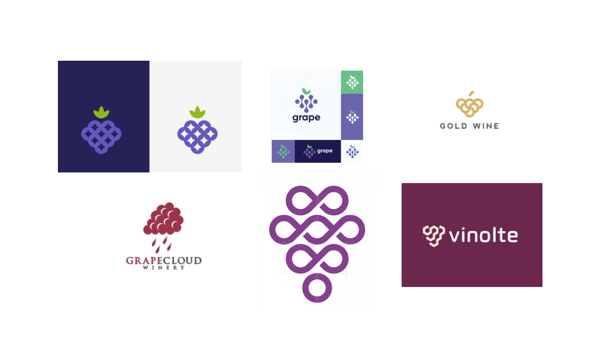
Creative Concept and Art Direction
The visual challenge was to represent all of this in a simple, memorable, and applicable symbol.

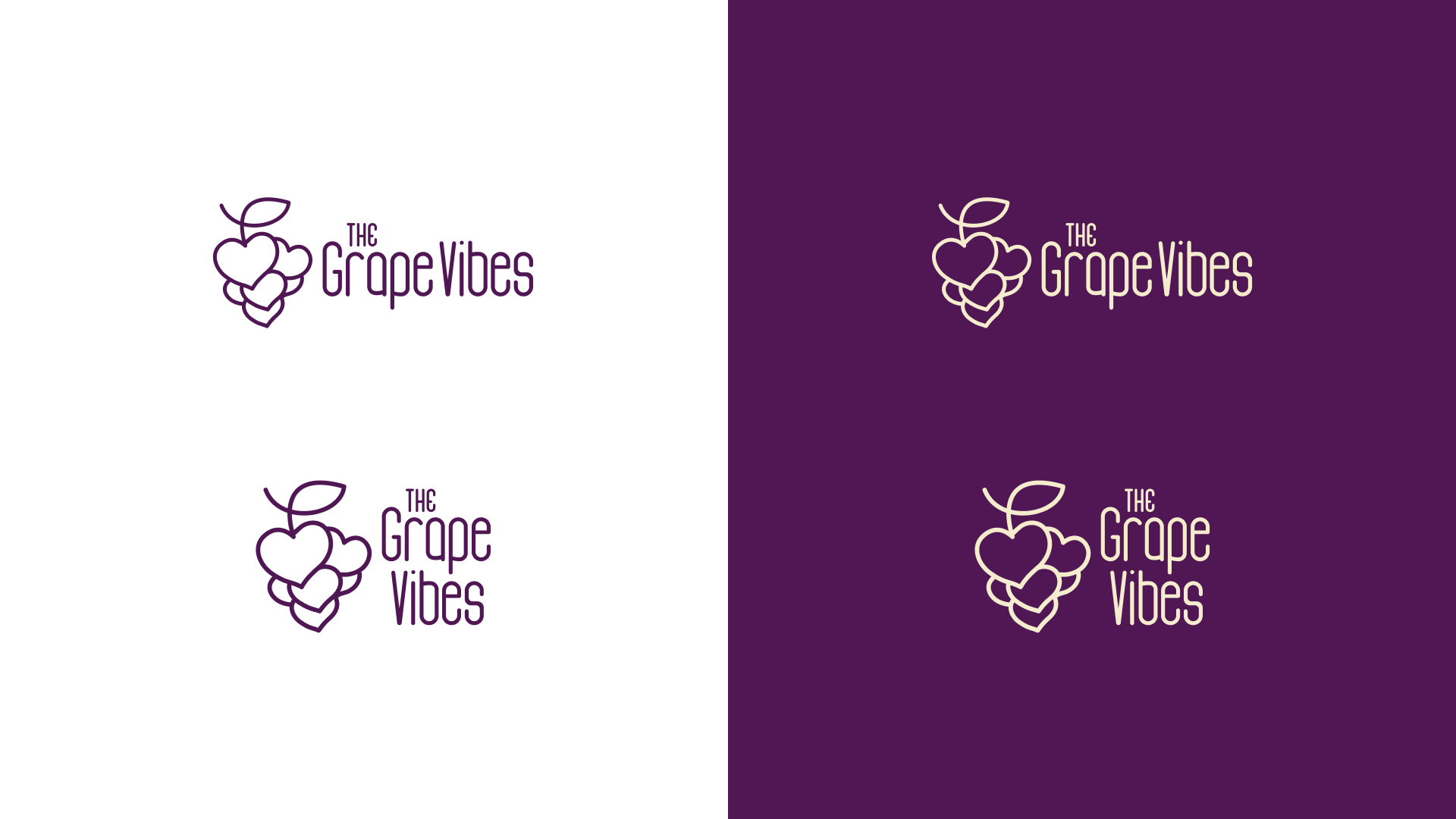
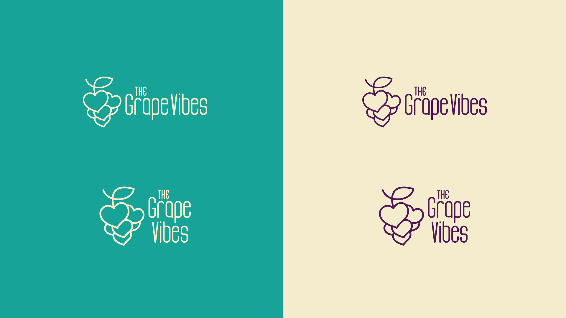
The idea of uniting a bunch of grapes with interconnected hearts brought the perfect balance between the product (grape/wine) and the emotion (love, vibe, celebration).
This union has become the brand's central icon, supported by friendly and elegant typography that conveys personality without excessive ornamentation.
Color Palette and Typography
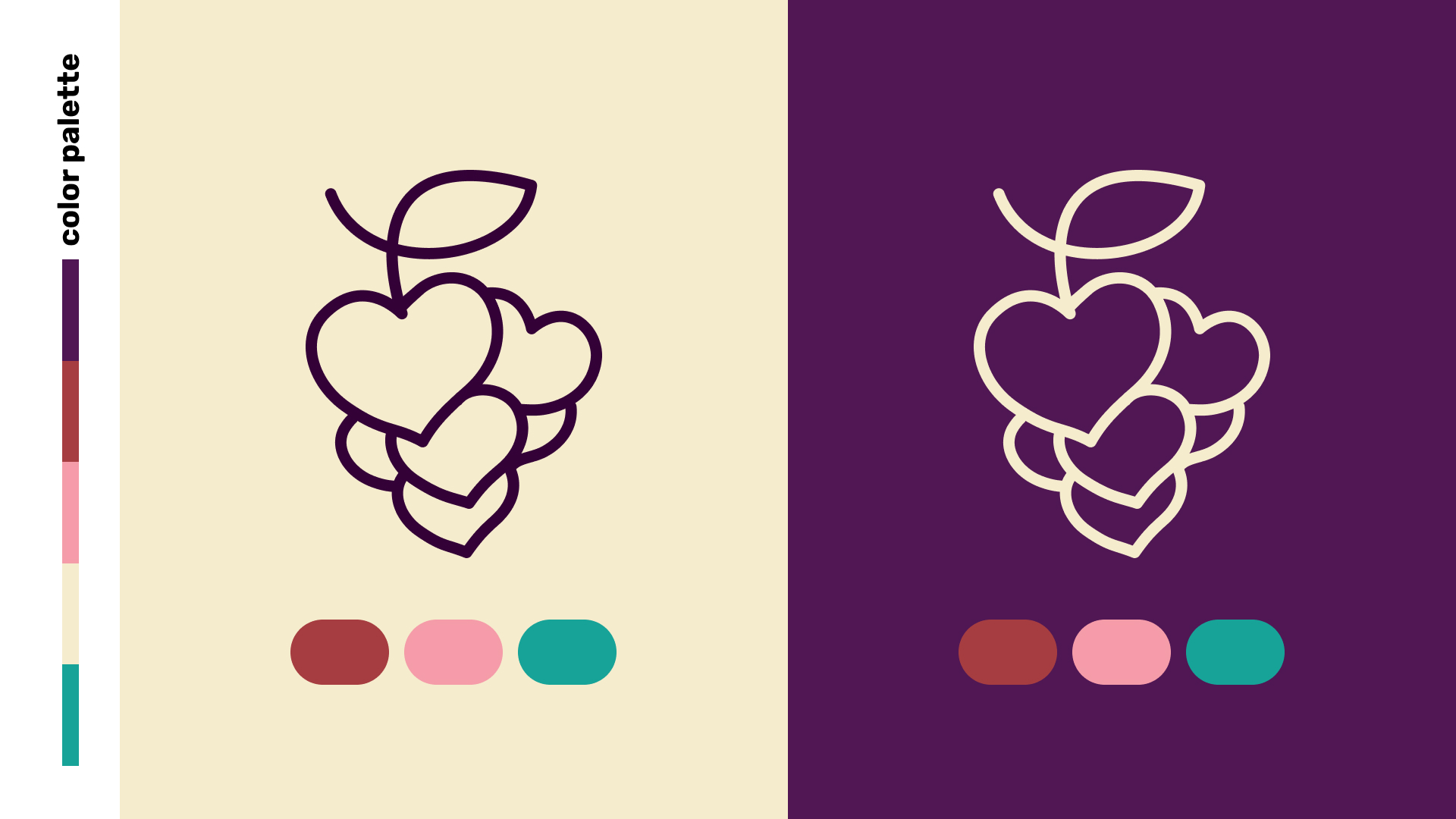
The palette mixes traditional wine (dark purple) with softer tones, such as cream, peach and turquoise, reinforcing the idea of lightness and modernity.

The chosen font (Adline) has organic and soft lines, which match the brand's emotional and accessible proposal.
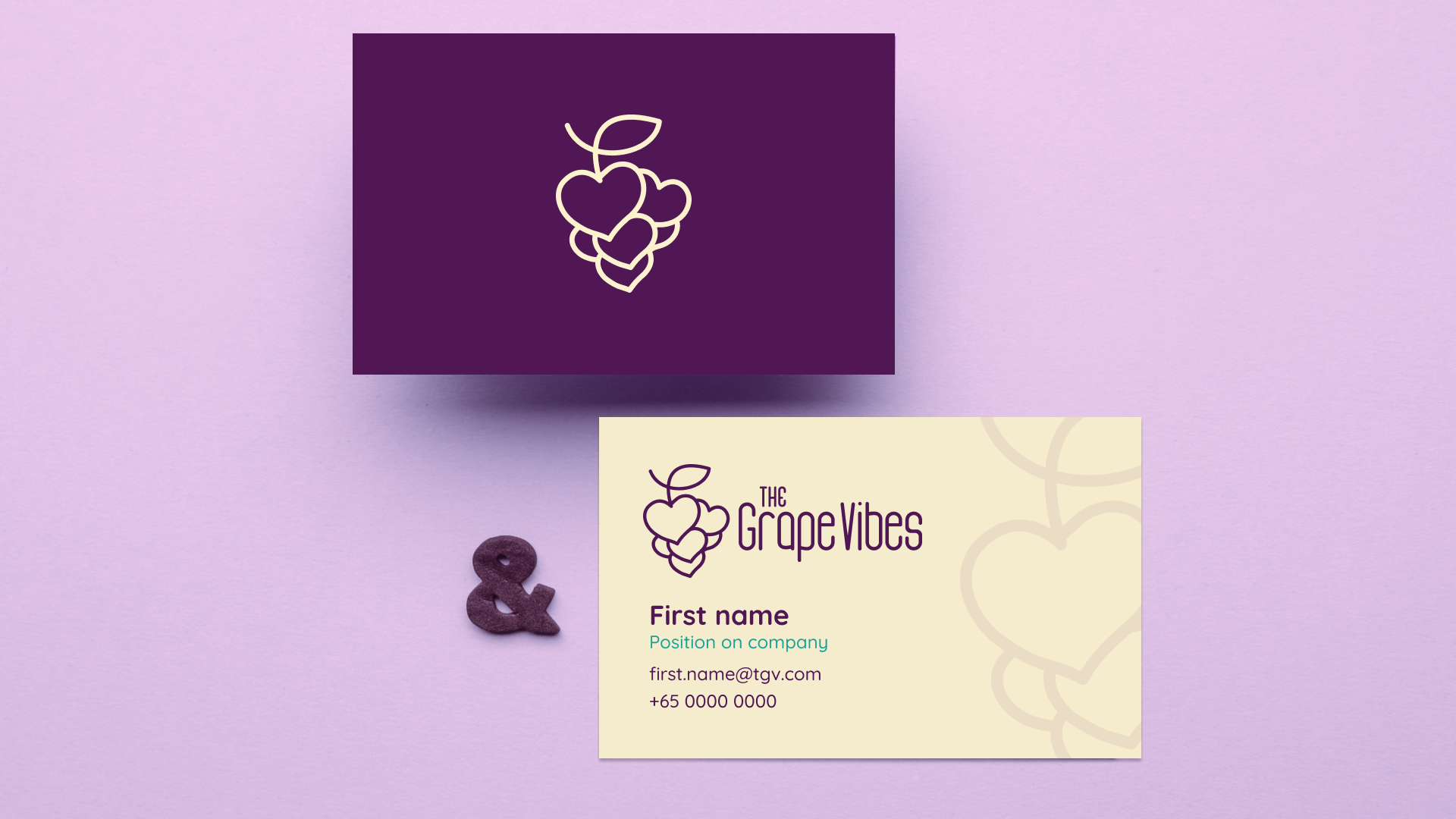
Complete Applicability and Identity
With the identity finalized, I created applications that help make the brand tangible: packaging, cards, labels, and digital pieces.
These applications reinforce the visual concept across different formats and platforms, maintaining consistency and flexibility.
Conclusion and Results
The project was delivered in a short timeframe, and the client implemented the identity in its Singapore operation via Carousell. The brand became recognized by the public as "charming, memorable, and distinctive" — according to feedback from the founder himself.
This project epitomizes my strategic branding approach: market research, emotional design, and real impact, even for small brands.

